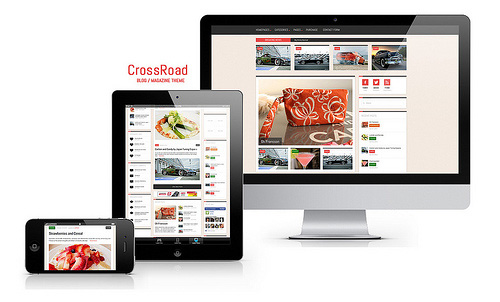
responsive screen size testing using css content tag

When testing your responsive media queries with various screen sizes, if you don't have a tablet to test this on, then your limited to testing all possibilities of your website design on those actual devices,but if you have a large desktop screen you can test various large, medium and small (mobile) responsive screen sizes by dragging your desktop screen in.
The difficult with this is knowing what pixel size the screen applies to when dragging in your browser window.
I have found a useful and easy way to output a message to the screen so you can see what pixel size your window is at when your dragging the desktop browser screen in.
For each media query you can output a message using the css content property which is supported in all major browsers.
Responsive Media Query Examples:
Medium screen size query focusing between landscape mobile device to a landscape desktop view.
@media only screen and (min-width: 480px) and
(max-width: 960px) {
#content:after {
content:"maximum width 960px";
}
}
Large size media query focusing on maximum screen size of 1280px.
@media only screen and and (max-width: 1280px) {
#content:after {
content:"maximum width widest screen ";
}
}
You can change the message for each media query which will help you preview the various media query sizes in your desktop which will reflect what you would see on any mobile or tablet device.
Photo Credit: ZERGE_VIOLATOR via Compfight cc
21st of February 2014 By Simon
