

responsive website design for your business in 2014
What is responsive mobile?
One of the new web trends of 2014 is the usage of mobile internet. This is key to a strategy online for your business to maximize your online visibility.
Website design is developed to fit the standard (1024px) width desktop view, but nowadays because of the developments mobile and tablet's, it's becoming essential to consider how your website appears on these devices.
How can a mobile website benefit your business?
Your business will lose out if you are not focused on mobile nowadays. People searching for businesses on a mobile device will pick up local area results if they have the option enabled on their phone.
If your website is designed specifically for the following devices, then the user experience on a mobile will far outweigh a non-responsive website, giving you advantage over your competition and enabling your customers to use your site effectively on these devices as well as a desktop.
- Mobile = 350px (portrait) 480px (landscape)
- Tablet = 768px (portrait) and 1024px (landscape)
Responsive website vs Non-responsive
When people visit your website on a mobile, unless your websites designed in a way to respond to different devices, which is called "fluid width", then your website will appear at the same "fixed" height and width of your mobile or you can do the standard pinch effect to zoom in. The responsive version of a website will display in a good size to the device you’re using without having to pinch the screen as this would have been designed to scale to the width of your mobile or tablet.
Example of responsive to non-responsive
Below are three websites on an iPhone device, see if you can tell which two websites are designed for mobile devices?
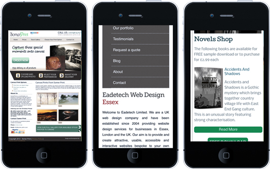
If you guessed right you will see the middle and the right sites are responsive websites as they fit better and display in conjunction with the devices height and width and the elements of the site fit nicely, whereas the left website is not clear unless zoomed in.
Consider moving your website into responsive in 2014. If your interested in getting a website designed with responsive then give Eadetech a call or contact us for a quotation
13th of January 2014 By Simon